 Metal
MetalThis is a talk I gave at Monitorama.eu in Berlin, September 19, 2013.
Did you know that bear is Bär in German? Which, on the other hand, is berry in Swedish, and bears obviously eat berries as breakfast. Meanwhile, a berry is Beer in German, which does sound very German when you think about it. But I’m already digressing.
Germans, and the Berliner especially, are of course very fond of bears, which is the only explanation I could come up with for why I was chosen1 to give this talk here. In particular, they like polar bears here – Eisbären in the local lingo. But it wasn’t always like that.
In 1930 in Stuttgart, an innkeeper threw a large feast serving smoked polar bear ham. The result: 100 falling ill and 13 dead because of trichinosis caused by Trichinella spiralis, a little fella that looks like this:

The moral of the story: always cook your bear meat well done. And now, after hearing this tale, I’ll guarantee you, you will remember it every time you’re cooking polar bear meat. And that is the power of a story.
We’ll get back to the topic of storytelling in a little bit, but let’s first have a quick look at what we know about the human brain and mind.
Duality of the mind – a farce in 2 acts
Act 1: Brain pixels and the human RAM
In 1998, psychologists Daniel Simons and Daniel Levin carried out an experiment. They hired a professional actor to approach people walking on the street and ask them to give them route instructions on a map. While the targets were looking at the map intensely, something weird happened. Two workmen carrying a door walked between the helper and the actor. The door, of course, was smoke and mirrors. Behind it, the person who had asked for help, was swapped to another person. Most of the targets did not notice. The actor was swapped to another with different hair color, then different clothes, and finally from a man to a woman. And yet, more than half of the subjects failed to notice that they were talking to a completely different person.
What this tells us is that our attention is very, very limited. This comes mostly down to two things.
Our focus of vision is tiny
The human vision is a bit like a digital camera. Light is directed through a lens to a “sensor”, the retina. However, this human CMOS is nothing like the one made of silicon. While a digital camera sensor has an even grid of pixels, the brain pixels are anything but. In the center of our vision, called as fovea, we can resolve as much as 100 pixels in the area of a needle pin, at arm’s length. This is more or less where the so-called retina screen resolution comes from.
However, the fovea, at that same length, is only about the size of a thumbnail. Outside that, the “pixel density” goes down really fast. In the periphery of our vision, we can’t really detect any details at all.
The obvious question here is, how then can we process a more or less sharp image of our surroundings? The answer is: we don’t. But we cheat. We move our eyes rapidly to scan our vision, which creates an illusion of a sharper image than it really is.
But this isn’t such an issue, is it? I mean, we can just memorize what we just saw to create a more comprehensive picture of what we just saw. Right? Well, yes and no.
Our working memory is very small
We can, indeed, store items in what is called short-term or working memory. To stay in computer metaphors2, it is a bit like RAM. It is fast, but limited, and when something new goes into it and it gets full, something else must be thrown out. However, unlike its tech counterpart, working memory in us humans has not grown during the last years or even centuries. It is still ridiculously small: somewhere around 3-4. No, I don’t mean 3-4 gigs, or even megs. Hell, not even kilobytes or bytes. 3-4, period.
Let’s look at a short demo video of this. Please don’t continue reading this article further before you have watched it. It takes less than two minutes.
Did you notice the gorilla (or one of the other changes if you had seen the original gorilla video beforehand)? About 50% of people don’t, even though they are looking several times (this was proven with eye tracking equipment) right at the beast, which is quite an amazing demonstration of the limits of our attention.
So what does this lack of attention mean to us as graphic and visualization designers? To put it short, it means the world. As an example, you can’t put two things the viewer should be comparing against each other very far from each other, because the viewer just can’t keep the other one in her memory long enough to make the comparison. Thus the first rule of thumb is: make comparisons viewable with as few eye fixations as possible, preferably one.
The second rule is: maximize the data-ink ratio. The ratio, coined by the visualization guru Edward Tufte, means the amount of data conveyed by the visualization divided by the amount of “ink” used. To put it in another way, the less stuff you have that is only there for visual looks and doesn’t have any particular meaning, the better. Good examples of this are needless and redundant color coding, the infamous PowerPoint pattern backgrounds3, and 3D effects now running amok in the Keynote world. Each of these makes the cognitive load of the viewer higher by fighting for her attention, which then leaves fewer resources in her brain left to actually make sense of the real information in the graph.
The whole field of human attention and cognitive science is huge both in general and applied to visuals in particular. We don’t have the opportunity to delve into it deeper here, but here are some pointers for you to learn more:
- Data Visualization for Human Perception by Stephen Few
- Visual Thinking: For Design by Colin Ware
- The Invisible Gorilla by Christopher Chabris and Daniel Simons
Act 2: Thinking, fast and slow
In The Magazine, one the several things Marco Arment has sold during the past year, pediatrician Saul Hymes recently wrote an article called Give It Your Best Shot. In the article, Hymes writes about one of his patients, a three-week-old girl who went dead because of bacterial meningitis, an illness passed to him by her unvaccinated older brother.
It was all of course preventable. There has been a vaccine against the bacteria in question, Haemophilus influenzae type b since 1984. So afterwards Hymes asked the mother of the two whether she’d now “give her children the benefit of modern medicine’s vaccinations.”. The answer was no.
What’s going on here?
In his best-selling book, Thinking, fast and slow, the Nobel laureate psychologist Daniel Kahneman lays out his theory of human thinking, splitting it into two systems, which he calls quite unimagitatively systems 1 and 2. System 1 is fast, intuitive, automatic and direct. System 2 is slow, analytical, and not activated in many day-to-day tasks at all. It is also lazy, trusting the intuition of system 1 much more than it should. It wouldn’t be such a problem if system 1 wasn’t as prone to many errors and biases as it is. It draws conclusions long before the conscious mind does. What makes matters worse, we almost always think we made these intuitive, erroneous decisions knowingly.
And this, in many ways, is what is going on in the heads of the people in the anti-vaccination community. Let’s look at some of the biases potentially at play here.
Availability Bias
We prefer wrong information to no information.
– Rolf Dobelli in The Art of Thinking Clearly
Because of information readily available to us, we often make totally erroneous assumptions of how common or proven it actually is. If our grandfather smoked a lot but still lived to 100-years-old, we easily think that smoking can’t be that bad for you. Or if a celebrity in the TV claims that her son got autism from vaccinations, hey, why not? We use statements like these to prove something, but they don’t of course prove anything. The plural form of ‘anecdote’ is not ‘data’.
Because of availability bias, we systematically overestimate the risk of catastrophes we see often in the media, such as terrorist attacks or natural disasters, and underestimate the boring, but much more likely causes of death, such as diabetes and cancers. We attach much more likelihood to spectacular outcomes. And what could be more spectacular than a centerfold model and her son with an illness obviously caused by greedy pharma companies and their conspiracies with public health organizations?
Conjunction Fallacy
Conjunction fallacy means that the more vividly something is presented, the more likely it is for us to believe it is the truth. At intuitive level, we have a soft spot for plausible stories.
So when Jenny McCarthy goes to Oprah and tells about her son that “My science is Evan, and he’s at home. That’s my science”, no matter that…
- the single study combining vaccines to autism has long since been disproven, its author has lost his doctor’s license for fraud, and Lancet has finally published a retraction, and that…
- based on some evidence, her son’s (who supposedly was cured from autism in 2010 through diet and other means) symptoms point to Landau-Kleffner Sydrome or, in layman’s terms, delayed development, not autism,…
…people still cry and clap their hands. As Hymes writes,
“To paraphrase George Lucas: So this is how science dies — to thunderous applause? In the court of public opinion, data, and statements, and science are no match for an emotional parent and her child.”
Story Fallacy
We want our lives to follow a tight-nit story that is easy to follow. We talk about understanding surprising events, but that’s not really true. We simply build the meaning into them afterwards.
Media is a champion at this. Just think about the rampant “Apple is doomed, just like with PCs in the 1980’s” narrative. No matter what the facts say, the tech journalists who subscribe to the above notion will distort and retrofit them to their preferred narrative. Hollywood is of course another master at it and this obviously gives an edge to McCarthy over her opponents, the science community who try to convince the public with hard data and statistics.
Unfortunately in this case, stories attract us (and you’ll soon learn why) while the abstract makes us bored out of our minds. Thus, entertaining but irrelevant issues are often prioritized over relevant facts.
Confirmation Bias
Confirmation bias means that we systematically ignore and dismerit facts and opinions that disagree with our own beliefs and worldviews. If we really like BMW’s, we very easily just disregard test articles that give them bad grades and eagerly read through every word in pieces that adore them. The more strongly held a belief is, the stronger the bias is as well.
When we combine these four biases, it’s not so hard to understand why the science community has a hard time convincing the McCarthys of the world. As a result, there have recently been several outbreaks of measles in the US, something that already was completely eliminated from the country. The cases have almost without exception happened – like recently in North Texas – in vaccine-skeptical communities.
The anti-vaccination community is an extreme example, of course. I mean, we’re mostly talking about religious whackos, right? We, who are pro-science, would never succumb to such fallacies, right? Let me tell you about another cognitive bias.
The Overconfidence Effect
As proven over and over again, we systematically overestimate our knowledge, talent and our ability to predict. And not just by a little bit but on a giant scale. The effect doesn’t deal with whether we’re correct or wrong in single estimates. Rather, it measures the difference between what we know and what we think we know. The most surprising thing about the effect is that experts are no less susceptible to it than normal people – on the contrary. As Dobelli writes:
If asked to forecast oil prices in five years time, an economics professor will be as wide of the mark as a zookeeper will. However, the professor will offer his forecast with certitude.
The positive side of stories
But let’s not be negative here. The flipside of all this is that stories are a very powerful way to get your point across and people to remember what you’re trying to teach them. Why is this?
Quite simply, our brains are evolutionarily wired to respond strongly to stories. When we listen to a presentation with mostly boring bullet points, it hits the language processing areas of the brain, where we simply decode words into meaning. And then what? Nothing.
On the other hand, when we’re told stories, the aforementioned parts are not the only ones that fire. Any other areas in our brain that we’d use when experiencing the events of the story are as well. So if we hear a story about a delicious dish, our sensory cortex gets fired up. If the story is about action sports, our motor cortex is activated. Thus, a good story can put our whole brains to work.
Because of this, in a way we’re synchronizing our brains with our listeners. As Uri Hasson from Princeton says:
“When the woman spoke English, the volunteers understood her story, and their brains synchronized. When she had activity in her insula, an emotional brain region, the listeners did too. When her frontal cortex lit up, so did theirs. By simply telling a story, the woman could plant ideas, thoughts and emotions into the listeners’ brains.”
So what do you need for a good story. Copyblogger lists the following five things.
- A hero
- A goal
- An obstacle
- A mentor
- A moral
Granted, telling stories visually is much harder than verbally. It should not be treated as impossible, though. After all, movies and cartoons are to a large degree visual. So while the above five points are mostly meant for verbal storytelling, keeping them in mind even when weaving narrative with visualization can be of huge help.
It is important to build continuum, a narrative to your visualizations. The information presented needs to be integrated, rather than a bunch of unrelated pieces. You also want to create relevant emotions and affect to your presentation, and here it helps to link it to the viewers existing knowledge. However you do it, try to make your message more memorable and thus likely to impact behavior.
And whatever you do, keep in mind both a story and a visualization has to make sense.
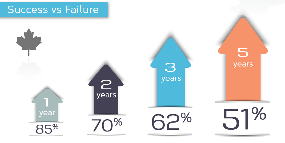
The above graph courtesy of WTF Visualizations.
And if you’re still convinced you can’t tell stories with visualizations, watch the TED talks by Hans Rosling.
So, how did Saul Hymes solve the problem of fighting a convincing, storytelling opponent? By telling stories himself. So while he still quoted the relevant stats and facts about the risks of taking vs not taking vaccines, he also started telling vibrant, vivid stories of individual kids dying or going deaf in his hands. After all, he didn’t have to convince people that taking vaccines is not dangerous. He had to convince them that not taking them is. And that is, of course, easy with a meaty story.
In closing
I want you to remember two things from this article.
- Our vision and short-term memory – and thus our attention – capacity are very limited. To present successful visualizations, we have to keep this in mind, plan for it and help the cognition of the viewers with cues.
- Storytelling is not important (just) because it is entertaining. It is important because it works – it makes people understand and remember our lessons better. This power might be based on fallacies but it is still very much a real effect that you can and should use to do good.
And wait, there’s more. I’ll just leave this thought here for you to ponder:
If you’re into data visualization, you’re not in the data business – you’re in the human communications business.
Visualization is just a tool to attain goals. Keep that in mind.
-
As a Bear Metal cubby.↩
-
Isn’t it awesome to describe real, natural things with metaphors from the tech world that no one would have understood just a few decades ago?↩
-
It is fair to ask why they are provided in the first place. They certainly don’t make the graphs look any better either, quite the contrary.↩